Canvas Credit Union
Finding the human side of financial services.
Creating a brand as relevant as it is loved
Public Service Credit Union began as a financial institution for Public Service Company of Colorado employees. Yet, after 80 years of business, it had experienced incredible growth transforming into a credit union for all Coloradans.
This evolution in membership had left its name irrelevant. As well, with the arrival of a new CEO, there was a cultural shift from a formal and traditional environment to a feeling of belonging, approachability and family. The company was hungry for a brand that would accurately recognize and convey the rich and loveable culture that was brewing internally.

"A financial provider should be personable, knowledgeable, and people oriented. To believe in your goals and put them above the bottom line while balancing realism in finances is also necessary."
Putting people at the center
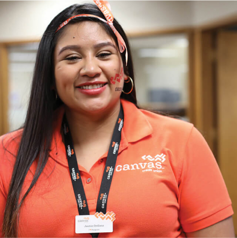
During the research phase, we learned how central people were to the PSCU brand. Employees continually outperformed competitors and members cited staff as a reason for their ongoing loyalty. But it was the bank’s approachability and an element of delightful quirkiness that were a welcome contrast to a formal and unapproachable category.
It became clear that employees and members would be central to everything the brand would become. They would have a significant role in what guided the creation of this new brand and would be central to building a reflection of their new culture.


"We see each of our members’ futures as a blank canvas, a unique possibility waiting to be painted. Our new brand and name bring to life the work we’ve been doing for over 80 years and today, we invite even more Coloradans to create their own unique and bright future with us."

Becoming Canvas together
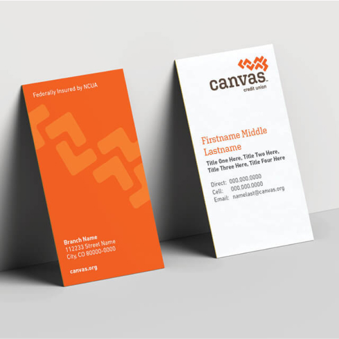
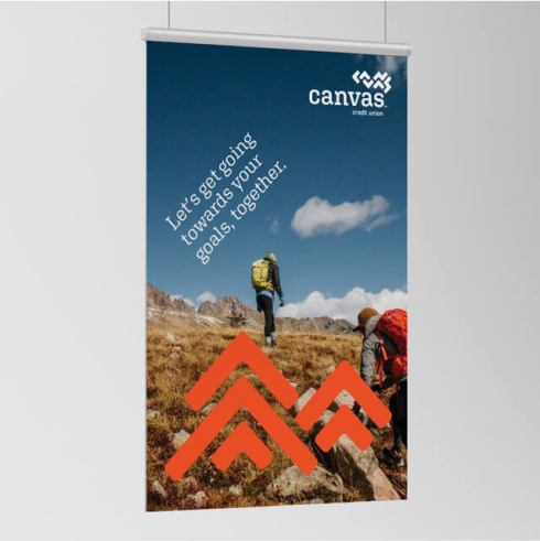
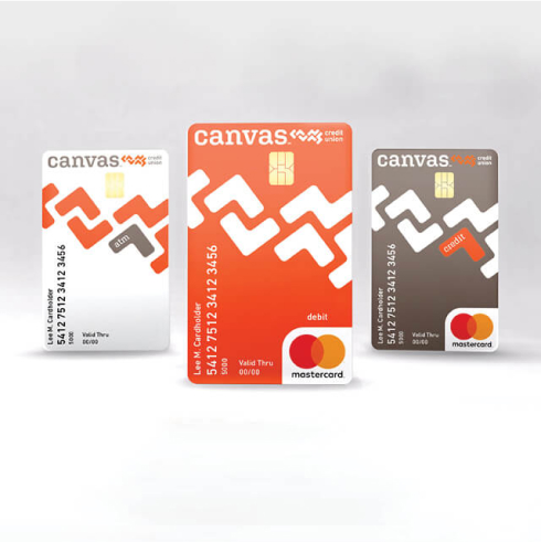
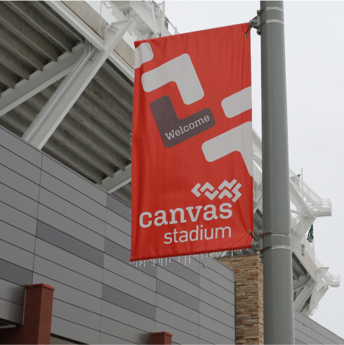
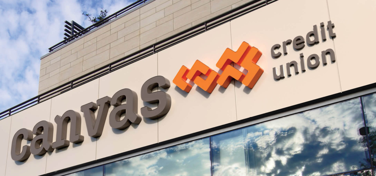
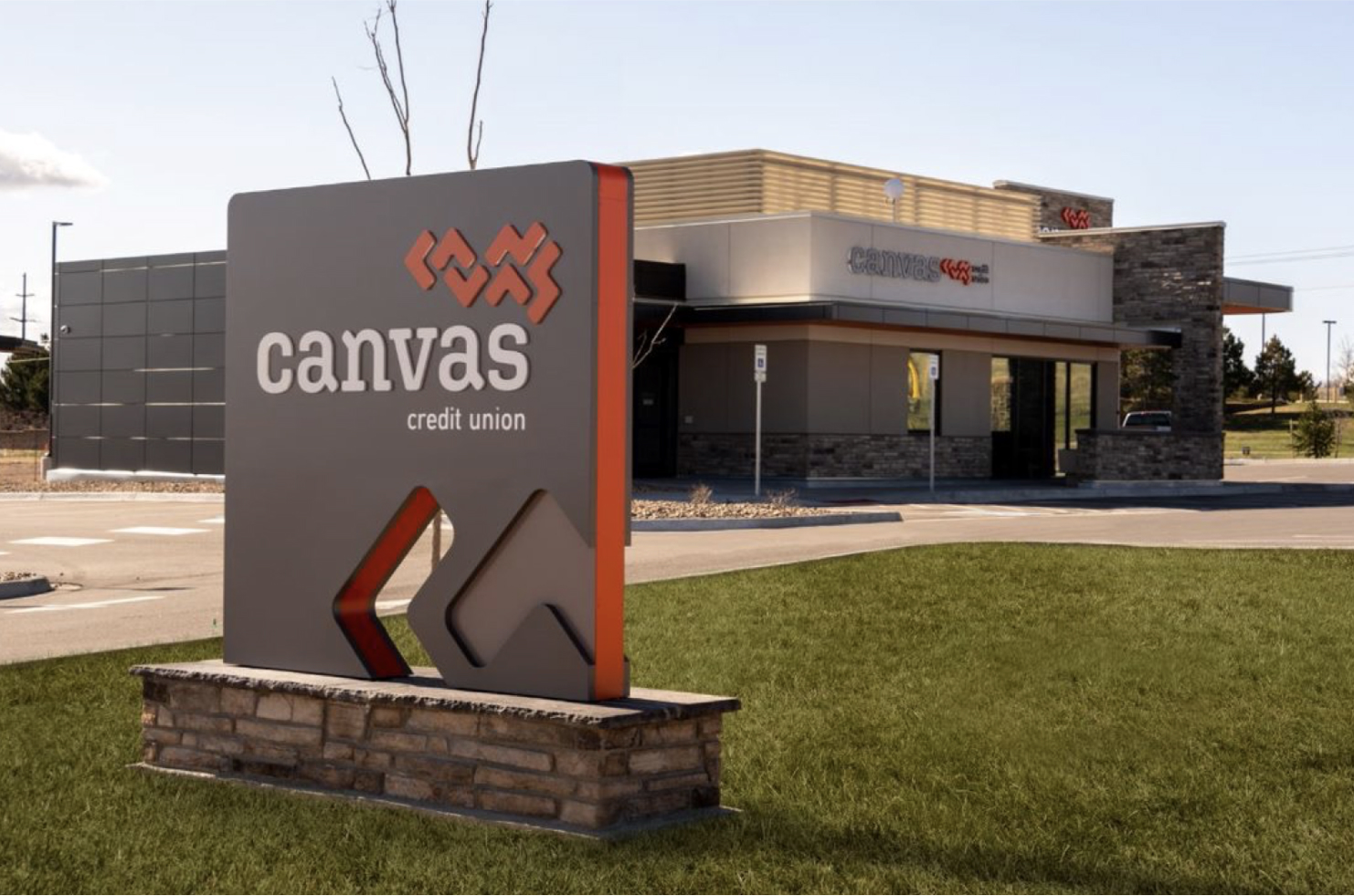
The combination of this sense of partnership with the organization’s personable atmosphere inspired the new name: Canvas. A canvas is where a member can paint the unique story of their life. It’s also a broad tarp that covers and protects. Delivering on this sense of comfort and weaving in casual approachability, we designed the logo to be simple and friendly using lowercase letters in the pathmark, in keeping with Canvas’s delightfully offbeat personality. Canvas encompassed everything the credit union was and wanted to be.
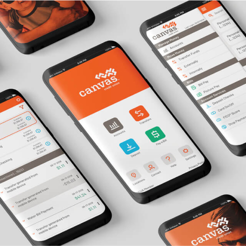
With a new name and logo, it was important to take the brand further and translate it into real-world experiences, which the people of Canvas would appreciate, understand and feel. Working together with the brand, we co-created an experience field guide with members from the frontline team. This guide helped translate the Canvas ideals into daily situations and invited employees to share their insights into how the brand should function. Brand ambassadors were also established to champion the brand across locations, day-to-day behaviors, routines and conversations. This helped the brand further promote community and belonging.
